Project - Phase 2 Deliverable#
Updates#
While working with Phase 2 deliverables and considering Phase 1 feedback, we decided to update some of our user stories to be more differentiable and created corresponding pages in our wireframes. We also made some changes to our data, as we are no longer considering culture as a factor in quality of life because of the insufficient number of years included in the dataset. For our regression, we are now utilizing 11 years of data in order to predict farther into the future. We have switched our quality of life dataset from a Eurostat API to a CSV of scores from the World Happiness Index. We made this decision because the Eurostat API for quality of life only had data for four non-concurrent years, and the World Happiness Index CSV had much more extensive data.
Data Visualizations#
For our data visualization, we generated nine plots using Plotly. The first four are scatter plots illustrate the relationship between quality of life and each of our factors, displaying graphs for quality of life versus healthcare, quality of life versus education, quality of life versus safety, and quality of life versus environment. The last five are line plots that visualize health, education, environment, safety, and quality of life over time.
These visualizations help illustrate any immediately obvious relationships between our chosen factors and quality of life, which will prove integral to our regression model that will use these factors to predict future quality of life. Using these graphs, we can see weak, positive relationships between quality of life and all of our factors, though safety is not as clear in their relationships with quality of life. After seeing these relationships visually, we will be able to better predict how our quality of life regressor model will be impacted by each of these factors, as these visuals can help guide the development of our regressor.
Visualizations#
Factors vs. Quality of Life
Factors over Time
Model explanations and plans#
We are planning on making two models, a supervised autoregression model with a lag of 1 year (AR1) and a cosine similarity score model. Our AR1 model will be used to predict future values of the happiness index. The current difficulties with this model are that it is very easy to have more features than data points, forcing us to use a gradient descent model instead. We would prefer to avoid this and keep our time lag low so that we can perform linear regression. We have 10 years of data, meaning 10 data points, and 5 features. We are considering adding a sixth feature representing pre, post and during covid. However, this may be collinear with other features because I expect many of the metrics used to vary with covid.
The cosine similarity score model is already implemented and will be used to compare what the student wants (they will input this using sliders) and a country that best matches their input. We have used an inverse-sigmoid function to translate the bounded data from the sliders to the unbounded but standardised data from the APIs. After test running this model it looks like it works pretty well.
This model can be found at https://github.com/mke27/life/blob/main/ml-src/cos_similarity.py
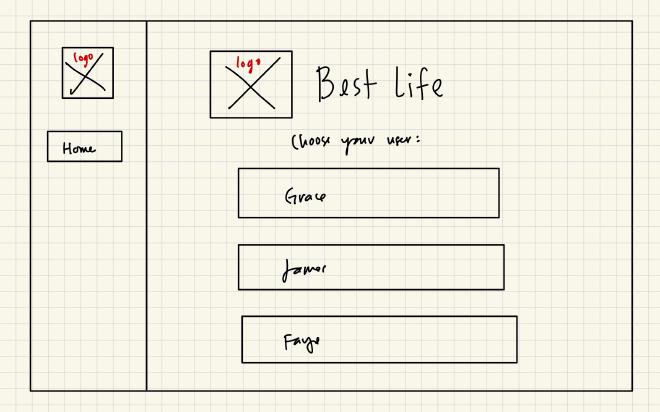
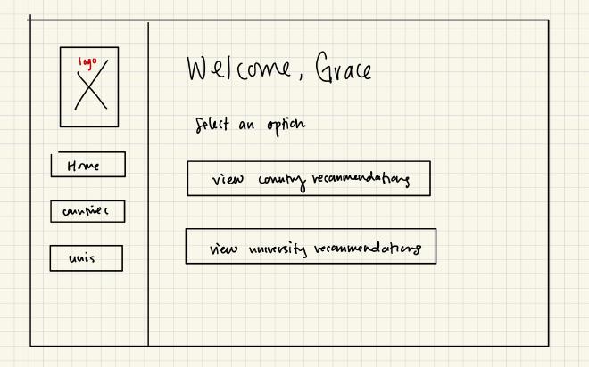
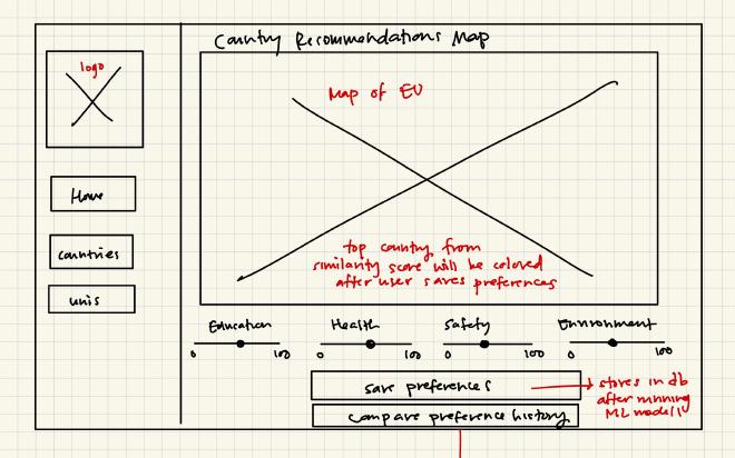
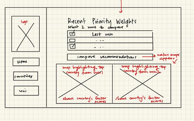
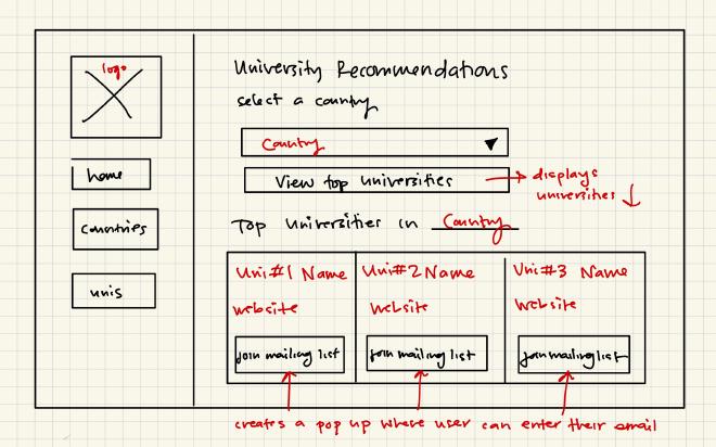
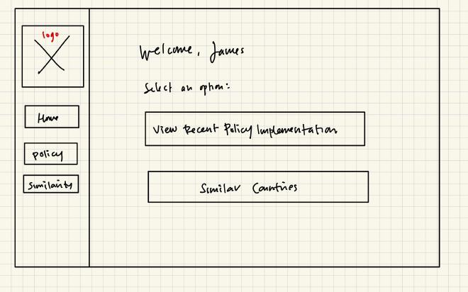
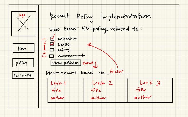
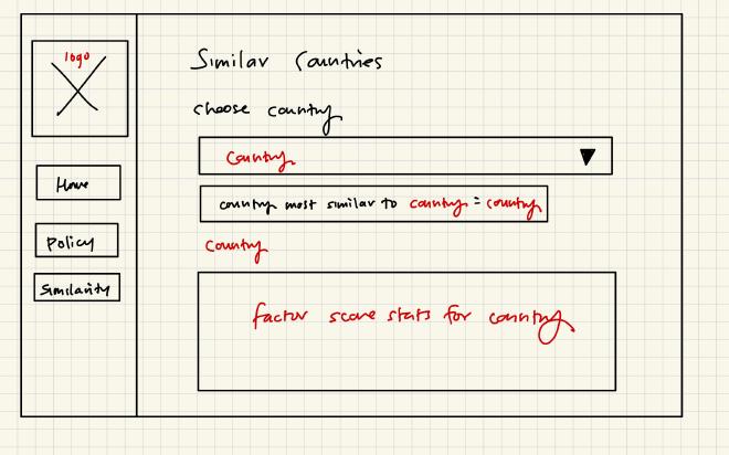
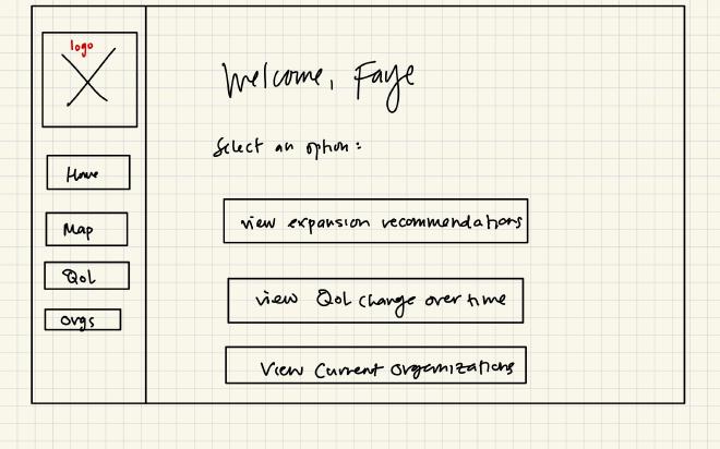
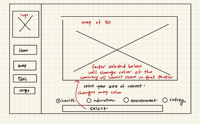
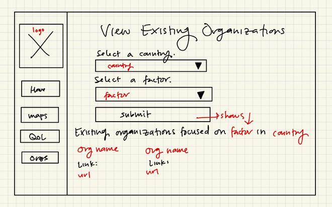
Wireframes#
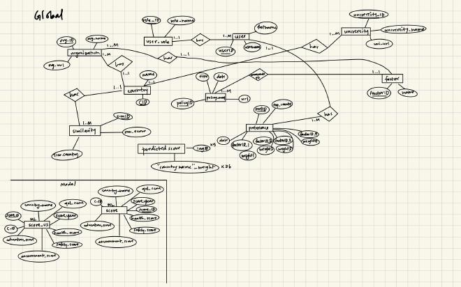
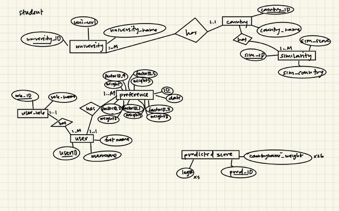
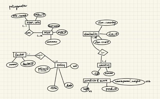
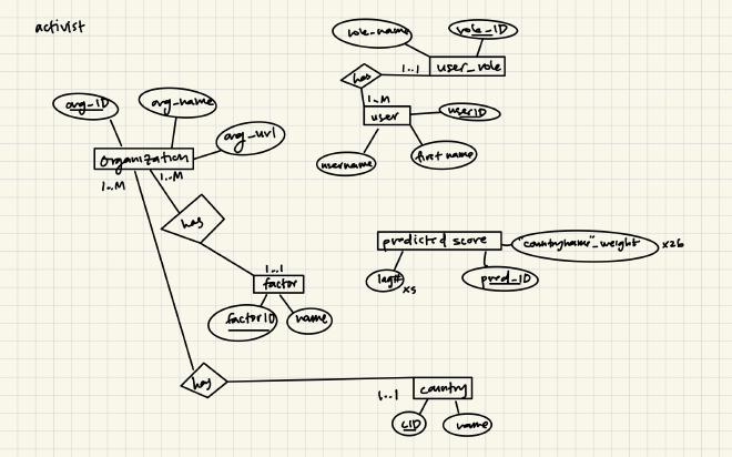
ER Diagrams#