Project: Phase 3 Deliverable#
Changes to the model since Phase 2#
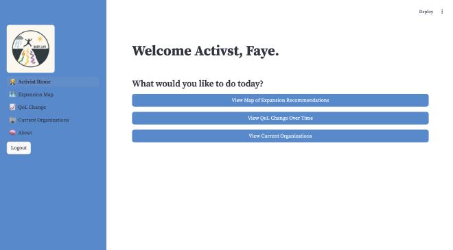
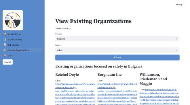
Since phase 2, we have made various changes to the data model, which are shown in our entity relationship diagram and relational mapping. We added a User_Role entity to match industry standards and ensure that there can be many different users for each persona. On top of this, we took into consideration that the Post feature, as seen for the activist Faye, did not make a large enough impact and did not add value to the overall project design, so we eliminated that feature in our application and the Post entity in our data model. Instead, for Faye, we included an entity, Organization. This allows the activists to see current organizations working in a specific area, whether that be education, health, environment, or safety. Through this new feature, Faye is able to learn more about organizations in a particular country that align with the factor she is most interested in. Additionally, we made minor changes regarding attributes and relationships in our ever-changing process to build a database that supports our needs.
All tables and whether the data will be sourced or generated#
- Similarity: sourced
- Country: sourced
- Rate: sourced
- User: generated
- User_Role: sourced
- Organization: generated
- Preference: sourced
- Factor: sourced
- Predicted_Score: sourced
- University: sourced
- Policy_News: sourced
- ML_Country: sourced
- ML_Scores: sourced
Data and ML issues#
Upon revisiting our EDA and attempting to write our PCA, we noticed significant gaps in the data we had for features such as Happiness index and Infrastructure scores. Many countries completely lacked the needed infrastructure score data, this meant our Cosine similarity model and our planned PCA and Autoregression model needed to be changed. Our Cosine model was inaccurate because it was missing certain countries entirely because they had no data for infrastructure.
To resolve this immediate issue, we decided to drop the infrastructure feature because we valued having more nations to be compared than having more features to compare.
This decision has implications for our supervised model as well. Because of the many random missing datapoints across all features, years and countries, we must find a way to plug the gaps.
We can solve the above by averaging the data from the previous and next year and inputting it as dummy data in the years that are missing some. We would definitely lose accuracy by doing this but otherwise we would have insufficient data. Alternatively, we could build another ML model to predict the most likely values for those missing years by using the previous and next years for that country. However, I don’t think we have the time to implement such a model on such short notice, so we have updated our data, first removing infrastructure as a factor and filling all other gaps in the data by averaging data from the previous and next year.
We planned to do a PCA to reduce the number of columns we had, but we realized that we didn’t need to do this because we had 12 columns of data for 27 countries, which is enough data to not have to do PCA when initially building our regressor model. So, we began building our time-series autoregressor model, which is currently completely built and running as expected, but has not yet been tested or cross-validated.
Data for ML#
Health, education, safety, and environment will be the features used for both our ML models. Our improved EDA from phase 2 has helped show us that these factors have strong positive correlation between them and quality of life, which lead us to the conclusion that they will be good at helping us predict future quality of life. We removed transportation/infrastructure as a feature due to large gaps in available data, but also, all visualizations created with this factor showed weaker correlation between it and quality of life, which means that it probably wouldn’t have helped us too much in our prediction model.
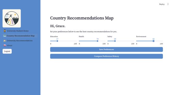
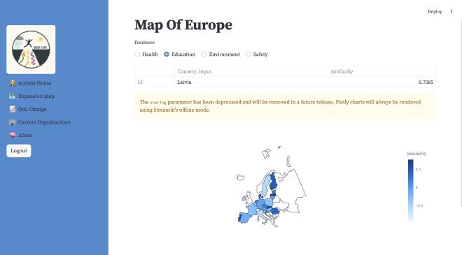
We will be using health, education, safety, and environment in our cosine similarity model. Users will be able to input their own personal level of significance for each factor, and the relative signficance of each factor will be used to determine the cosine similarity of those chosen factors and countries in the EU.
Rest API Matrix#
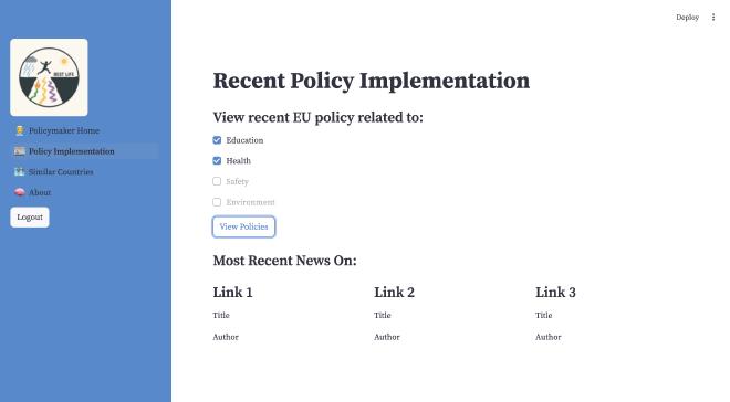
Currently, our REST API Matrix looks like this. The blueprint of users ties to features of our application that will be implemented in the next stage, which allows the removal of a user by user_id or updating a username. Additionally, we can retrieve information about the user attributes for a certain user_id and their role, which will help adapt our Home Page to a UI allowing users to select their username to log in in the next phase.
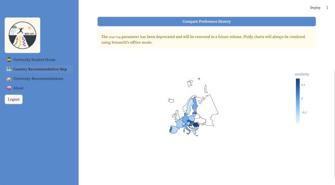
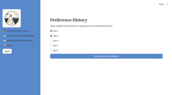
The blueprint grace relates to the interaction with the predicted scores from our cosine similarity model, which is seen with the persona grace when she can select the option to view a map of recommendations, which takes her to a page where she uses sliders to adjust how much each factor of education, health, safety, and environment mean to her which she can then save these preferences using the button which connects with our Post route. These preferences are then reflected in the European Union gradient map.
The blueprint model allows retrieving similarity scores from the cosine similarity ML model.
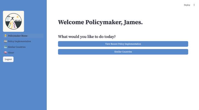
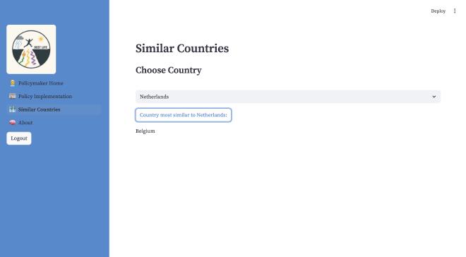
The blueprint country allows for the retrieval of all country names, which is used in multiple places in our application. Grace is able to select a country for university recommendations, and James is able to choose a country to view the one most similar to it. The other routes for this blueprint allow for the retrieval of factors and countries, which will be further integrated into our design.
The blueprint faye retrieves organizations based on country_ID and factor_ID, which is implemented in her persona. She can view existing organizations by selecting a country and a factor.
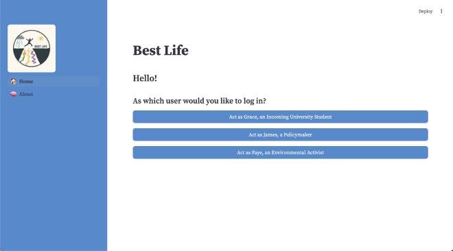
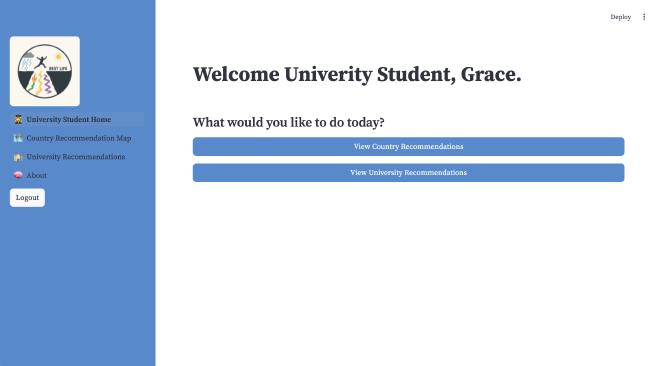
Current App#

Our application is a work in progress and we are excited to continue improving and implementing our features further!