Project: Phase 4 Deliverable#
Check out our developed application!
ML Models#
Our time-series autoregressive model uses quality of life scores taken from the World Happiness Index for years 2011-2022 with a five-year lag to predict quality of life scores for a specific country five years into the future (or really, five years past the end of our data, so up to 2027) with relative accuracy. The features of this model included 26 dummy columns of country indicators for each EU country, and then our five lag columns for our quality of life data. On the front-end, this model displays as a graph of quality of life scores over time with a line for either one country, or two countries to compare them. There is a line of demarcation between historical and predicted scores.
The weights produced by this model were stored in the database, and these are accessed in the autoregressor_all function that produces a list of dicts of historical and predicted scores for a given country up to 2027. This function can be called using the get_model_scores route, which is the input for the plot_qol function that exists on any page that requires a graph of quality of life over time.
This model was used for all our user personas.
- The university student can see a graph comparing historical and predicted quality of life over time ffor two countries from their saved preferences (created using the cosine similarity model based on their inputted preferences) on the “Past_Prefs” page.
- The policymaker can see a graph comparing historical and predicted quality of life over time time for their inputted country and the country most similar to theirs on the “Similar_Countries” page.
- The activist can see a graph comparing historical and predicted quality of life over time for two inputted countries on the “QoL_Change” page.
The cosine similarities score model uses the health, education, environment and safety scores taken from Eurostat for a given year. We gather this data for each EU member state so that our model can compare the input scores to the standardised scores of each country. The output of this model is a dataframe containing the name of each EU member state and a value between -1 and 1 called the similarity score. This score represents the cosine of the angle between the input vector and the EU member state vector. A value of 1 means an angle of 0, therefore very similar vectors. A value of -1 means opposite direction vectors meaning completely different.
This model is used by the prospective university student user and the policymaker user.
- The prospective university student can input her priorities using four sliders. The page then translates these scores from 0-100 into an unbounded inverse sigmoided score that stays generally between -3 and 3 (this stretches across most of our standardised values). The result is a chloropleth map showing the most similar countries to her input
- The policymaker can directly compare countries to eachother. He can select his country and look at another chloropleth map of Europe with similar EU member states shaded darker.
Checking of All Model Assumptions & Predictive Checks#
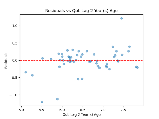
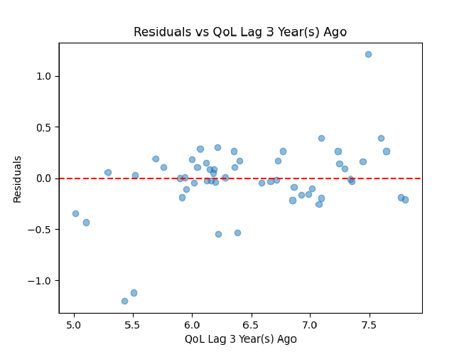
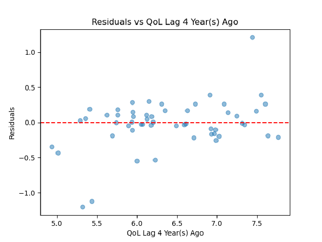
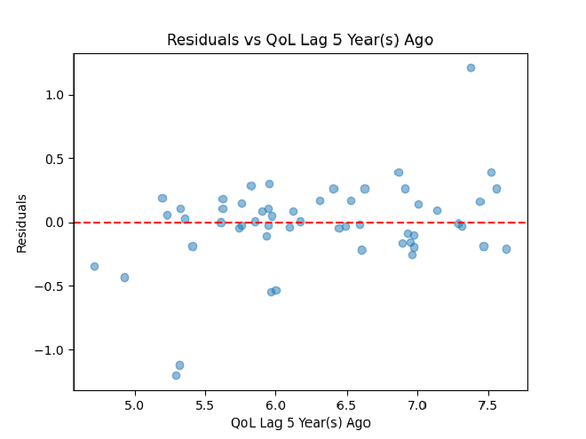
Before performing cross-validation, our time-series autoregressor had an R^2 of 0.99 and a mean-squared error of 0.006. After performing cross-validation, these values went to an R^2 of 0.62 and an MSE of 0.12. So, 62% of variance in quality of life scores can be explained by time, and the model comes pretty close to going through all points exactly. Using the residuals and x-values from our cross-validation, we then created x feature vs. e plots to assess linearity and homoscedasticity, an ordered e plot to assess autocorrelation, and a histogram of e to assess normality of residuals.
X-Features vs. Residual Plots
There are five of these to assess for each of our five lag columns.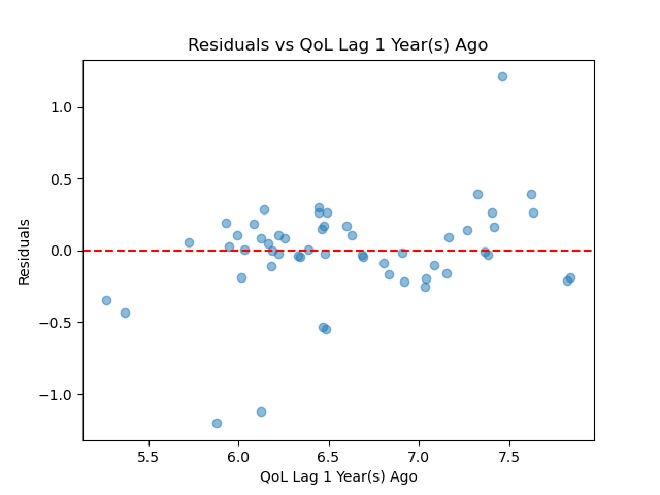
Ordered Residual Plot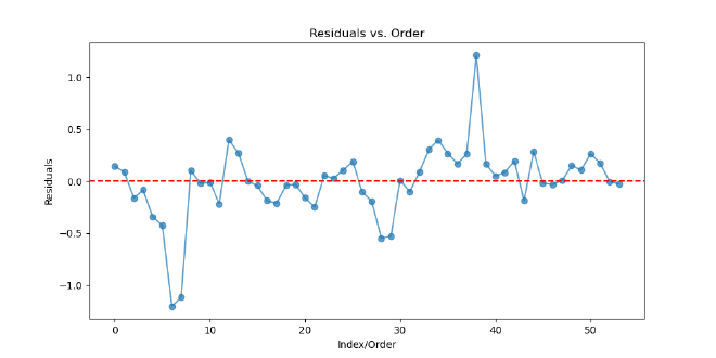
Histogram of Residuals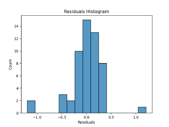
Ultimately, it seems that our residual plots are not the best, so some assumptions of linearity may not be met. Heteroscedasticity seems to be an issue, which could be fixed by transforming either the x or y feature. A linear model also may not necessarily be the best option here. We could tackle some of these issues by making more models for quality of life over time and comparing their cross-validated R^2 and MSE.
Software Architecture#
The Best Life application uses a three tier architecture with a Streamlit frontend, a Flask REST API serving as the middle layer, and a MySQL relational database on the backend.
UI Layer#
Our final UI layer evolved from wireframes with a broad concept into a couple of designed pages, and finally matured into the fully implemented design.
Through carefully designed routes we strove to deliver personalized experiences whether that be for the prospective university student, policymaker, or activist.
The prospective university student is able to view country recommendations based on sliders that allow them to weigh how important each factor is to them, receiving a top country that is most similar to their needs. They are able to view past preferences and compare these recommendations based on factor scores and predicted quality of life. The prospective university student is also able to select a country of their choice to view top universities, aiding in their academic pursuit.
The policymaker can view recent policy news filtered based on factor of concern in order to learn more and make well informed decisions regarding the overall quality of life of their citizens. Additionally, they are able to view countries similar to their own in order to learn more from others and apply it to their own country. Policymakers are able to consider other countries and implement policy that they see working into their own country.
The activist is able to view map of expansion recommendations based on selecting a factor which displays a mpa demonstrating countries of greatest need. They are also able to compare historical and predicted quality of life scores between two countries. Lastly, they are able to view existing organizations in the country of their choice based on selecting a country and factor, allowing them to connect with like minded individuals and expand their outreach.
All personas have access to an about page explaining the vision and purpose of our app and a profile section where they can edit their name, update their username, or delete their profile all together.
REST API Layer#
Our REST API provides the connection between the UI and database layers, allowing for data retrieval and interaction for app functionality.
Blueprints
- users consists of routes that handle user authentication, profile changes, and role-based access.
- country consists of country-related queries.
- faye has routes specific to the student persona as it manages preferences and university ranking endpoints
- grace contains routes specifc to the activist persona as it retrieves organizations by country/factor.
- james consists of routes for the policymaker persona as it exposes country similarity and policy news.
- model provides access to ML scores (standardized and unstandardized) and predictions
Each blueprint allows for user interaction providing the connection between the database layer, getting the information needed to display to make all of these UI features possible.
Database Layer#
The database layer contains 12 entities that form the foundation of our data model. A full explanation of the database schema is provided in the following section
Database Model#
The final database model is best displayed in our updated relational mapping. Here is our final global relational mapping.
In our database model we have 12 entities which structure and organize our data for our Best Life application.
ML_Score_US, ML_Score, and Predicted_Score store the data used by our machine learning models. ML_Score_US contains the unstandardized scores of each country by year for our factors of health, education, safety, and environment as well as the quality of life score. ML_Score stores the standardized version of the same attributes, used for the cosine similary ML model. Predicted_Score holds the the weights and lags produced by our times series autoregressive model, allowing for prediction.
User and User_Role support user login with role based experiences. User stores the specific information about the user and User_Role allows for each User to have a role, ensuring the features and pages accessible to the user.
Country plays a crucial role with many relationships as much of our data being stored is country specific, this table is referenced by many entities. Additionally, Factor contains the names of the four key areas which is health, education, safety, or environment, allowing for consistent referencing.
University stores information on top universities within each country which assists the prospective university student persona in evaluating academic opportunities. Preference stores the user’s selections regarding how much they weigh the value of each factor (health, education, safety, environment) enabling personalized country recommendation.
For the policymaker persona, Similarity provides data on countries similar to another country derived from cosine similarity calculations which enables them to explore comparative insights. Policy_News stores web-scraped recent policy articles for each country allowing policymakers to stay informed and make well informed decisions.
For the policymaker persona, Similarity provides data on countries similar to another country derived from cosine similarity calculations which enables them to explore comparative insights. Policy_News stores web-scraped recent policy artices for each country allowing policymakers to stay informed and make well informed decisions.
Organization contains information about organizations in specific countries addressing certain factors, so activists can find causes aligned with their interests.